Pencils for Success
Pencils for Success is a non profit that provides underprivileged students with essential school supplies. They had issues figuring out which schools and foster care centers needed supplies, and how to communicate what types of donations they needed. The organization wanted to have a better way of making themselves known to Title I schools in their area.
TIMELINE
August 2021 - December 2021
ROLE
Product Designer
BRIEF
Create a platform that helps organize the 300+ lbs of supplies the organization receives and distribute them to 30+ schools. Additionally, have a way to identify schools in need and let people know what specific donation items schools are in need of.
01 User Groups
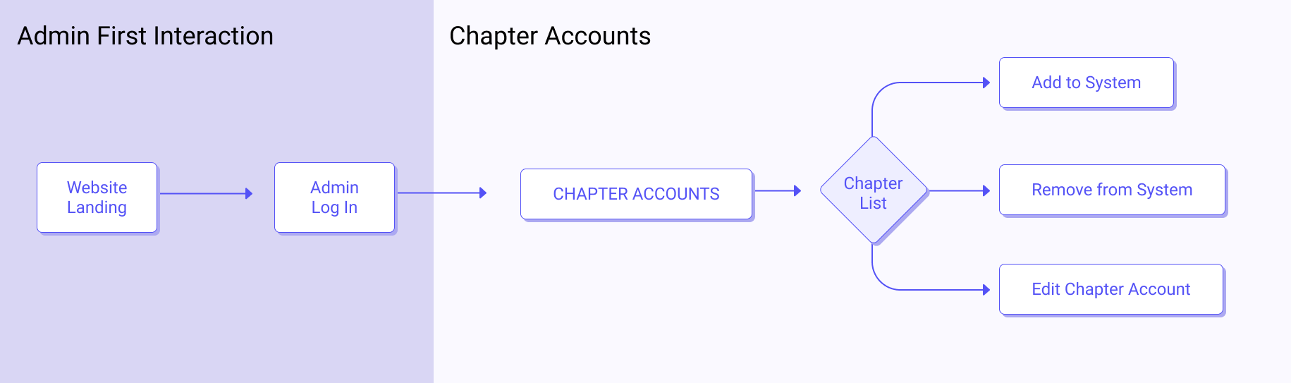
There were four main user groups: admin, chapter, recipients (schools and foster care centers), and donors. The main function that an admin needed to be able to do was manage all the chapter accounts, whether that be modifying information or adding new chapters.
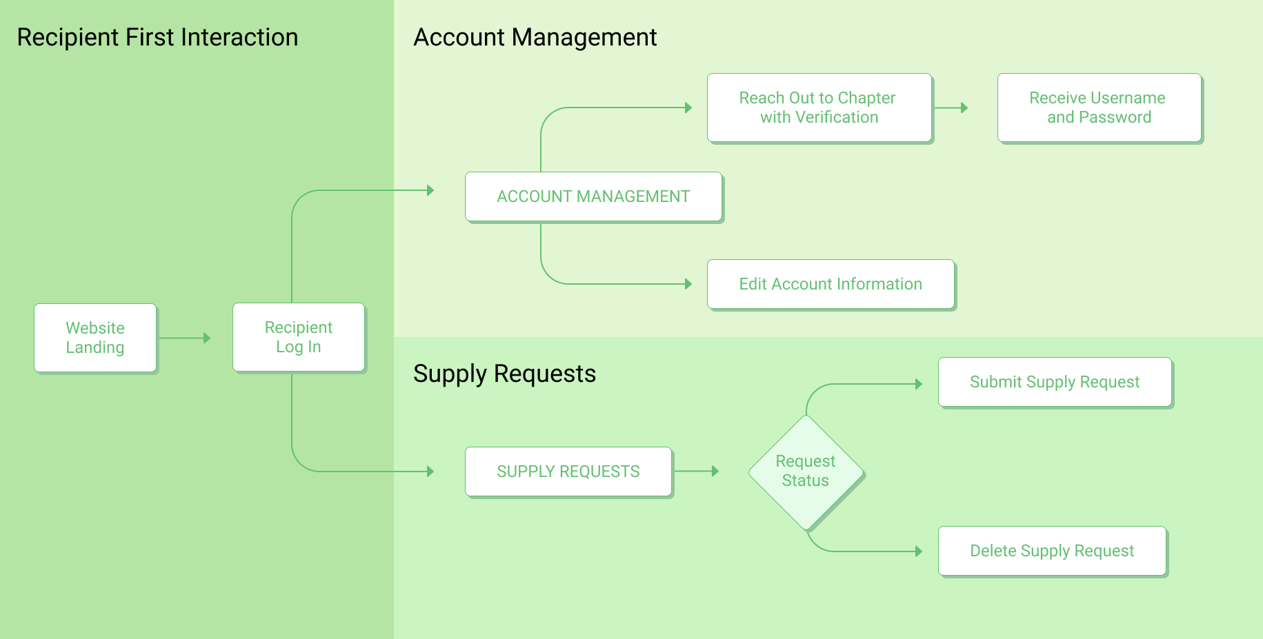
Recipients, which were mainly schools or foster care centers, had to be able to send requests for what supplies were most urgently needed.
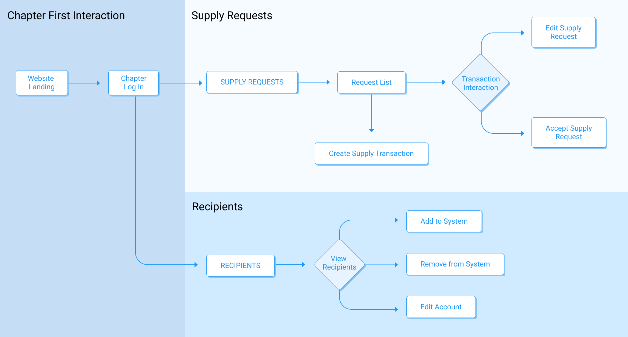
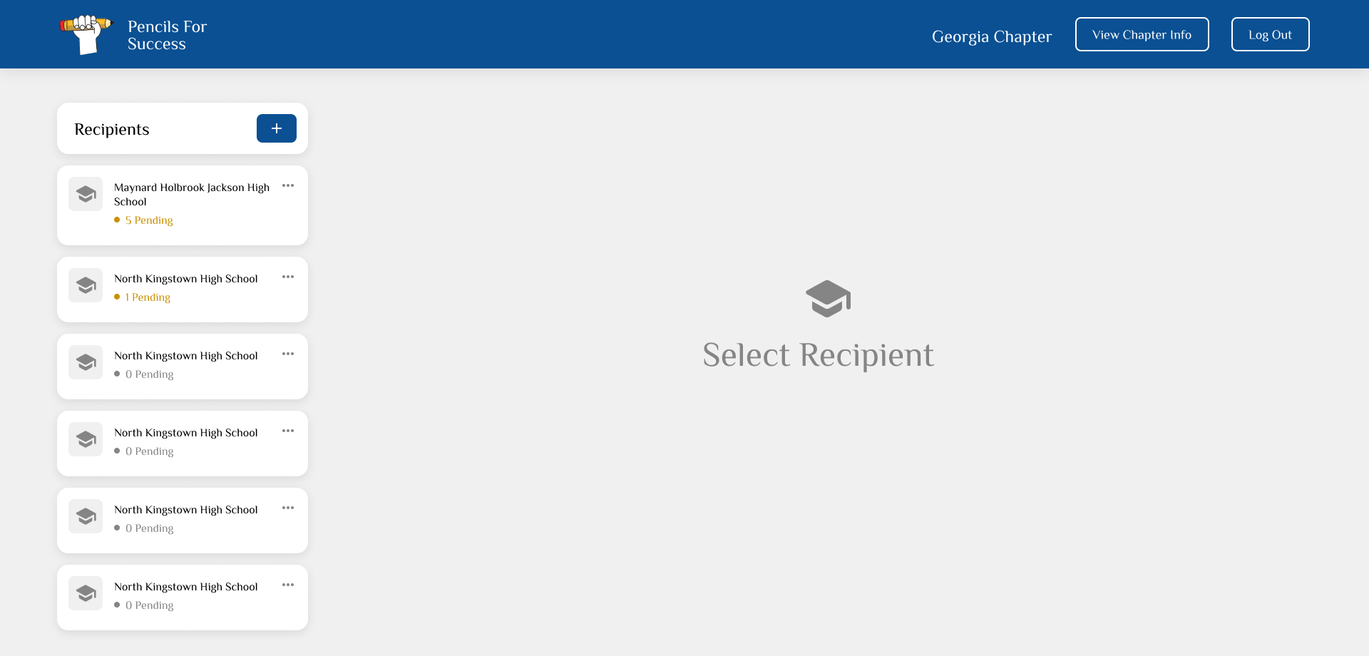
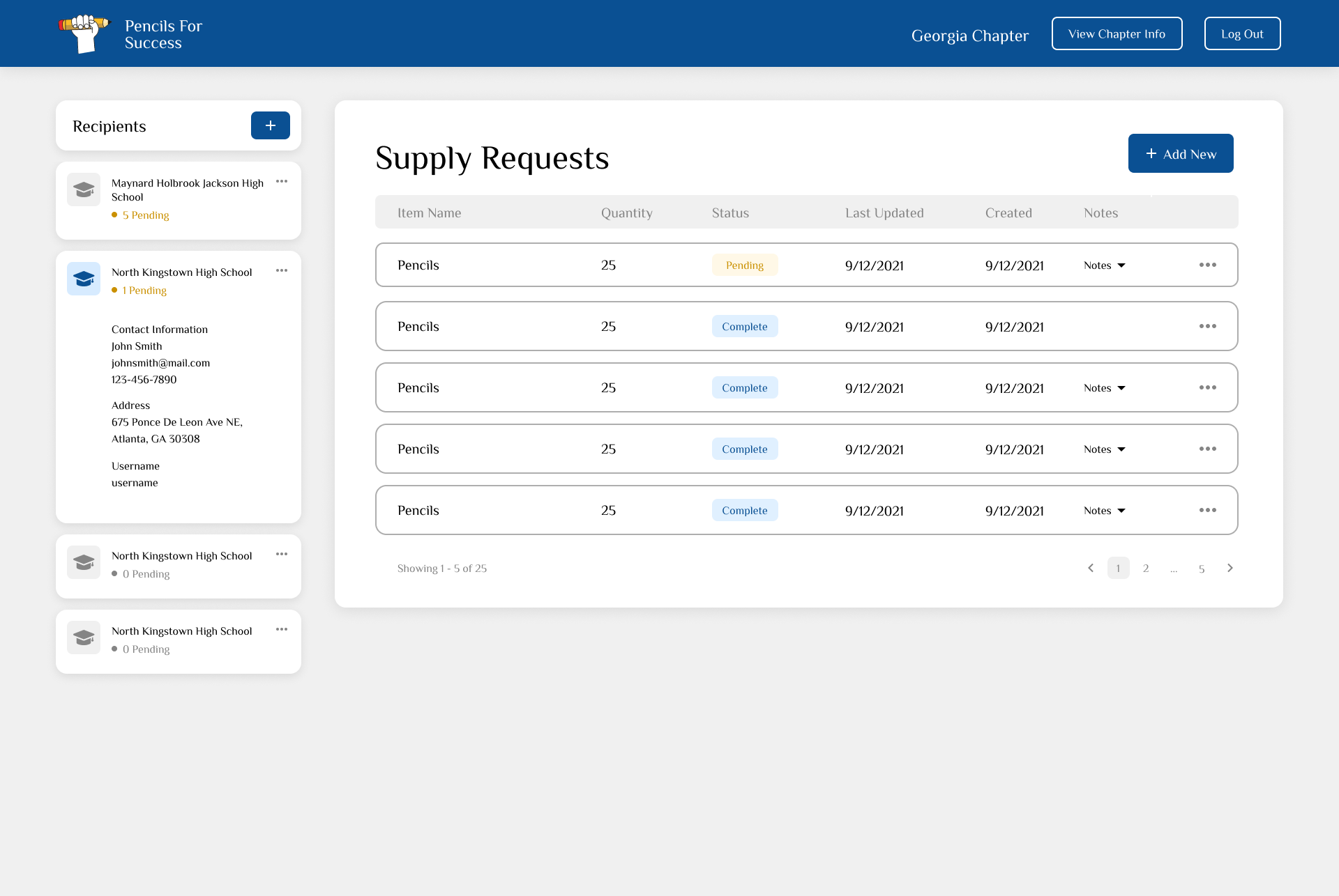
Chapters had the most functions out of all four user groups, as they had to manage the recipients in their respective area, as well as handle all the supply requests.
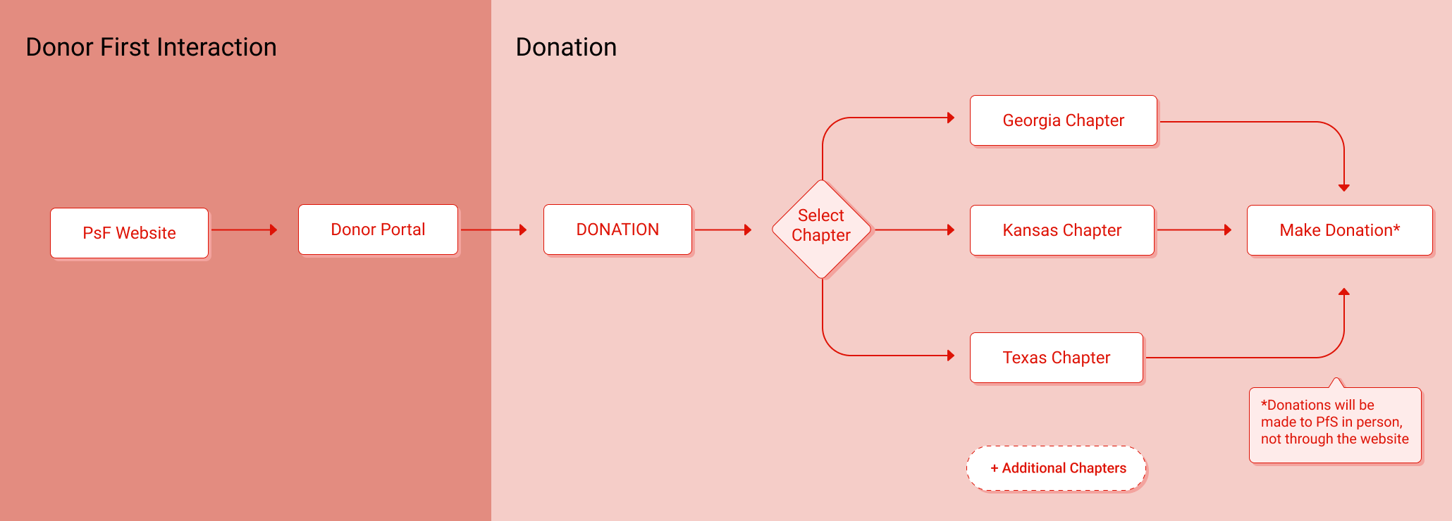
As for donors, they simply needed to be able to see the entire donation process to know what they had to do if they were first time donors, and see what supplies were in high demand.
02 Design Process
The admin and chapter view were drafted first, as the ability to modify account information and add/remove users would be similar across both users. For chapters, it was critical that they were able to quickly and efficiently handle supply requests and understand what certain schools needed. We wanted the layout to be simple and intuitive, but also convey enough information without displaying too much extraneous details.
Chapter Wireframe
Admin Wireframe
03 Showcase
We used the Chakra UI component library when we created the high fidelity mockups as a way to streamline the process and so that developers did not have to create all the components from scratch.
Some of our designs changed from our initial wireframe drafts, namely the way that chapters viewed their associated recipients. Previously, chapters would see cards with basic information of the school listed, as well as an image. There was no indication on the home page about the number of supply requests that a school had, and whether or not any action needed to be taken (e.g. approve supply request, modify request, etc.)
We changed the design to better have all the functions on the same page, without requiring the user to have to navigate through various pages to complete an action.