NYC Department of City Planning
The New York City Department of City Planning (DCP) wanted to redesign the homepage of their public facing website to create a more user centered experience that engaged the public and encouraged community participation. The scope of the project later changed to include the entire website, and I alongside another intern focused on redesigning the Data & Tools section of the site.
TIMELINE
June 2023 - August 2023
ROLE
UX/UI Designer
BRIEF
Conduct user research for the DCP website redesign and redesign the Data & Tools section
01 Research and Discovery
What can we learn about the current website, what aspects already work well, and where are there opportunities for improvement? Before diving into any primary or secondary research, the team wanted to keep technical constraints in mind, as that would influence the direction of the design. We arranged a meeting with the web team to cover constraints and what impact that would have on the design. The website was created using a Content Management System (CMS) called TeamSite, and its functionality made it difficult for more complex designs and novel interactions. However, we did not receive a firm answer on whether the redesign would still use TeamSite or if the agency would switch to a different platform.
There were three main goals we wanted to cover for the redesign:
1
Better understand the purpose of the website & who it serves
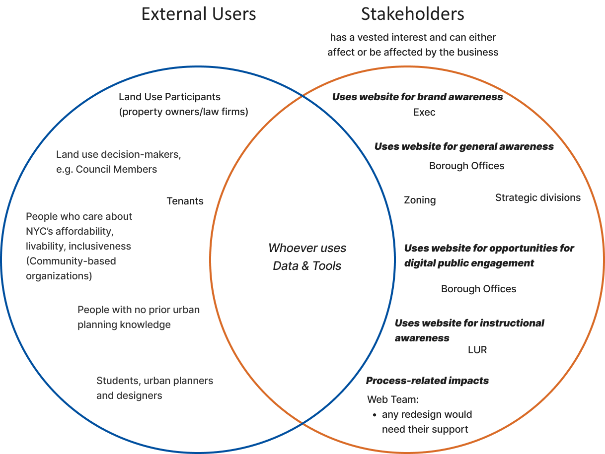
The team created a mind dump to identify the main user groups, dividing them into external users and stakeholders, with the overlap being users that used the Data & Tools section of the site. We also received analytics of user paths from 2022, and clicks and page views gathered from 1/1/2023 - 6/1/2023, which totaled to 1,077,057 views from 580,725 users.
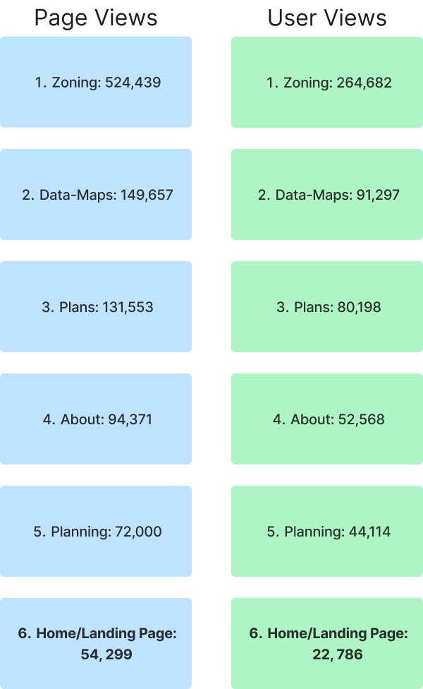
The Zoning section of the website received the most page views, and surprisingly, the home page received the least page views out of all the different sections of the website. That meant a good portion of users were accessing the Zoning page without going through the landing page at all. And while 17.2% of total home page traffic (around 16K user sessions) were users going to the Zoning page, the majority of user sessions was actually drop off.
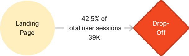
That was something we had to figure out if we wanted to improve the landing page experience. What were users looking for that the agency website was not meeting?
We took a look at other government agency websites (NYC Social Services, Gov.UK, NIH, etc.) to get a grasp of what other government websites looked liked. After analyzing other agency websites, we conducted a website audit for the DCP site, documenting issues like inconsistencies or accessibility concerns. There were a few opportunities for improvement, such as inconsistent sidebar navigation behavior or formatting, accordions hiding information or making it difficult to easily find something, and confusing hierarchy or layout.
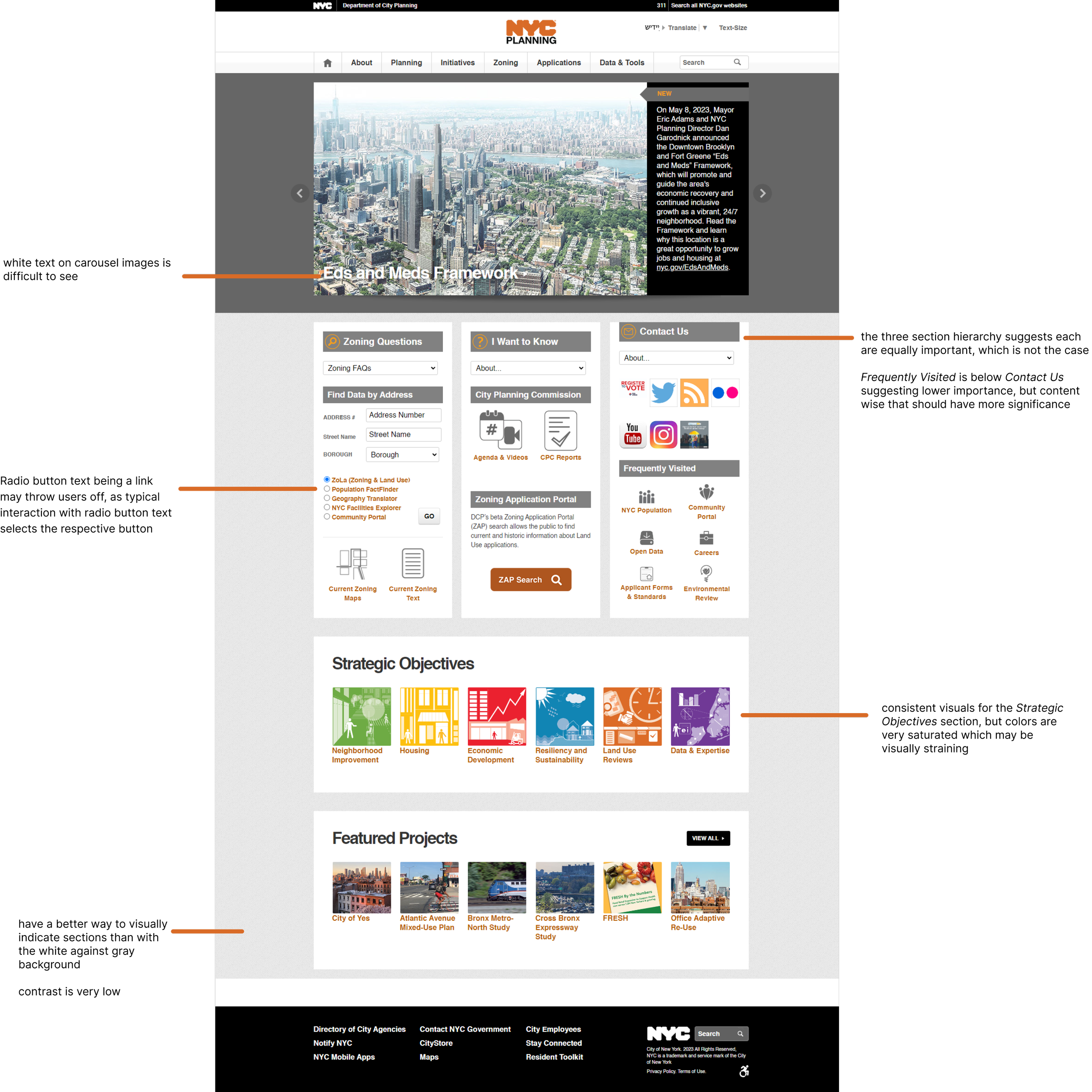
Overall, across the entire website, the navigation and layout was not grouped well, and there were inconsistencies with side navigation, which made the navigation process feel more convoluted. Content could also be grouped more efficiently, and visual design wise, spacing and alignment could be improved on for readability and organization. Additionally, components like icons varied in size and style, making the site feel less cohesive. In terms of accessibility, various areas of the site had low contrast, and many links were only indicated in one way (e.g. color and bolding) instead of various means.
Conducting the website audit gave us a general idea of the way components and layout were utilized throughout the site, and that lead us into the interface inventory. We went through each page on the website and compilied instances of elements such as color, typography, spacing, icons, buttons, etc. We noticed inconsistencies in visual styles and typography; there were also unexpected interactions and broken links or buttons.
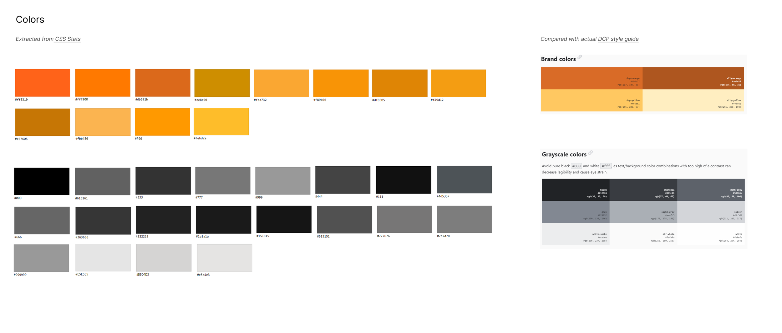
For instance, the colors taken from the site were much more varied than the ones listed on the DCP style guide (although it is slightly outdated).
2
Better understand usability of current website and user experience concerns
3
Discover problems in the current design including aesthetics, brand impact, accessibility
02 Scope
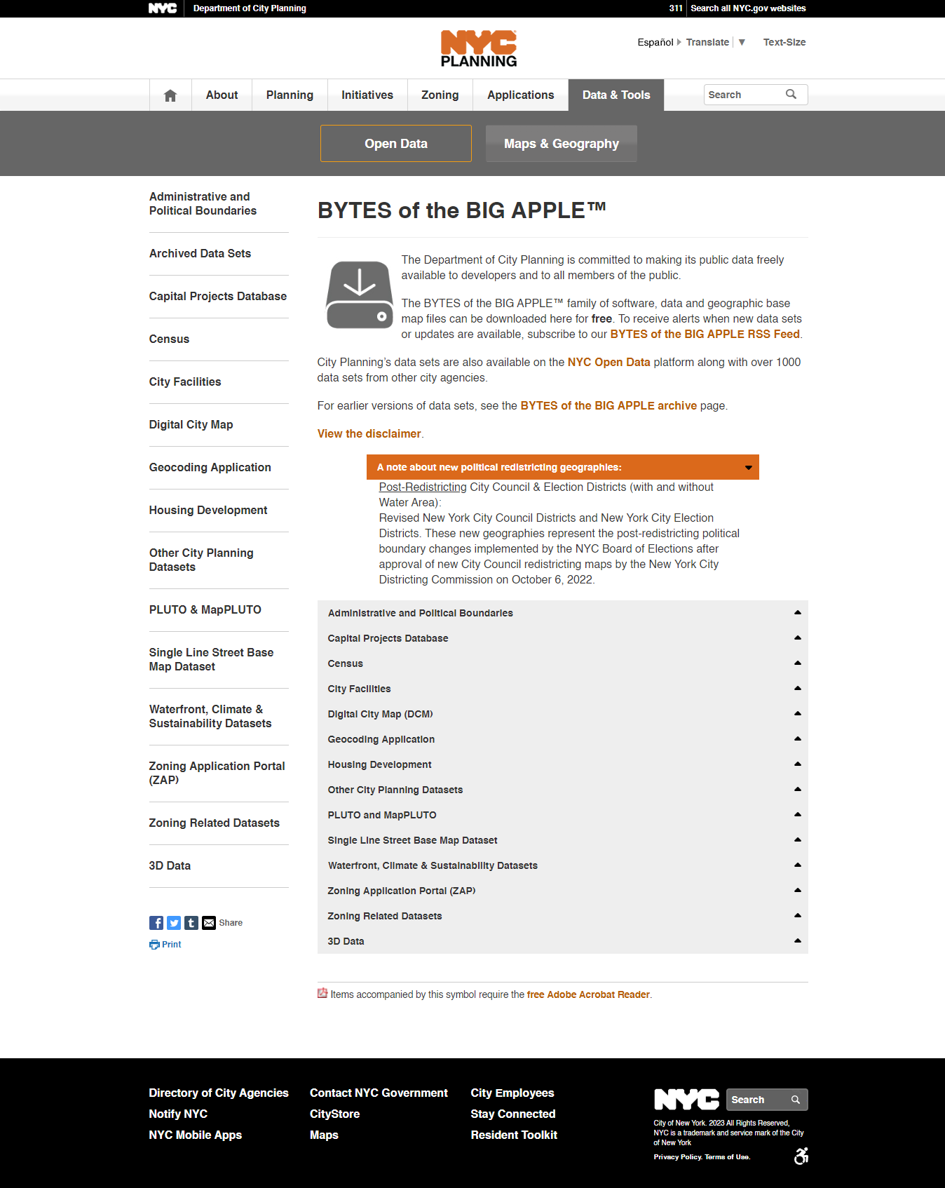
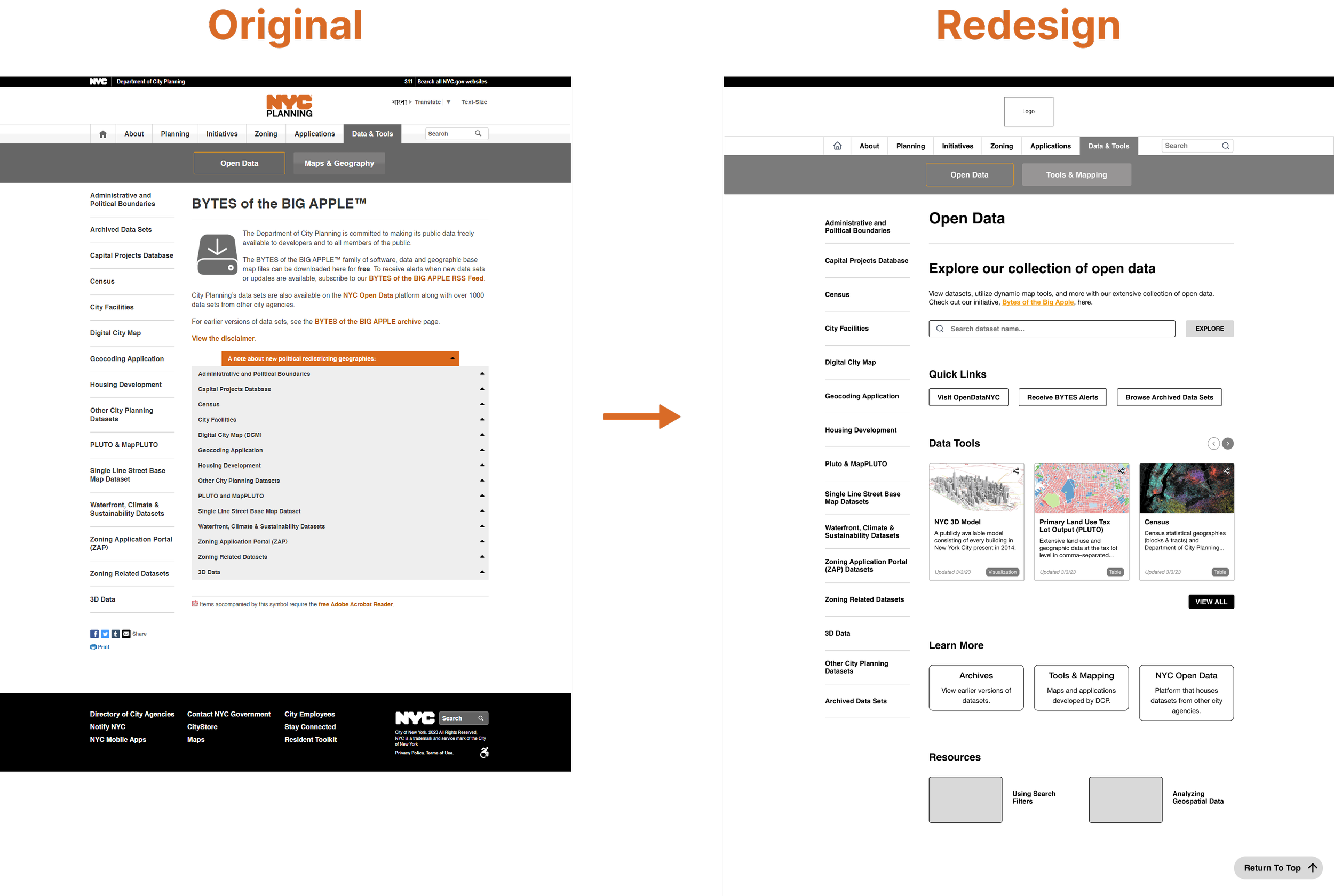
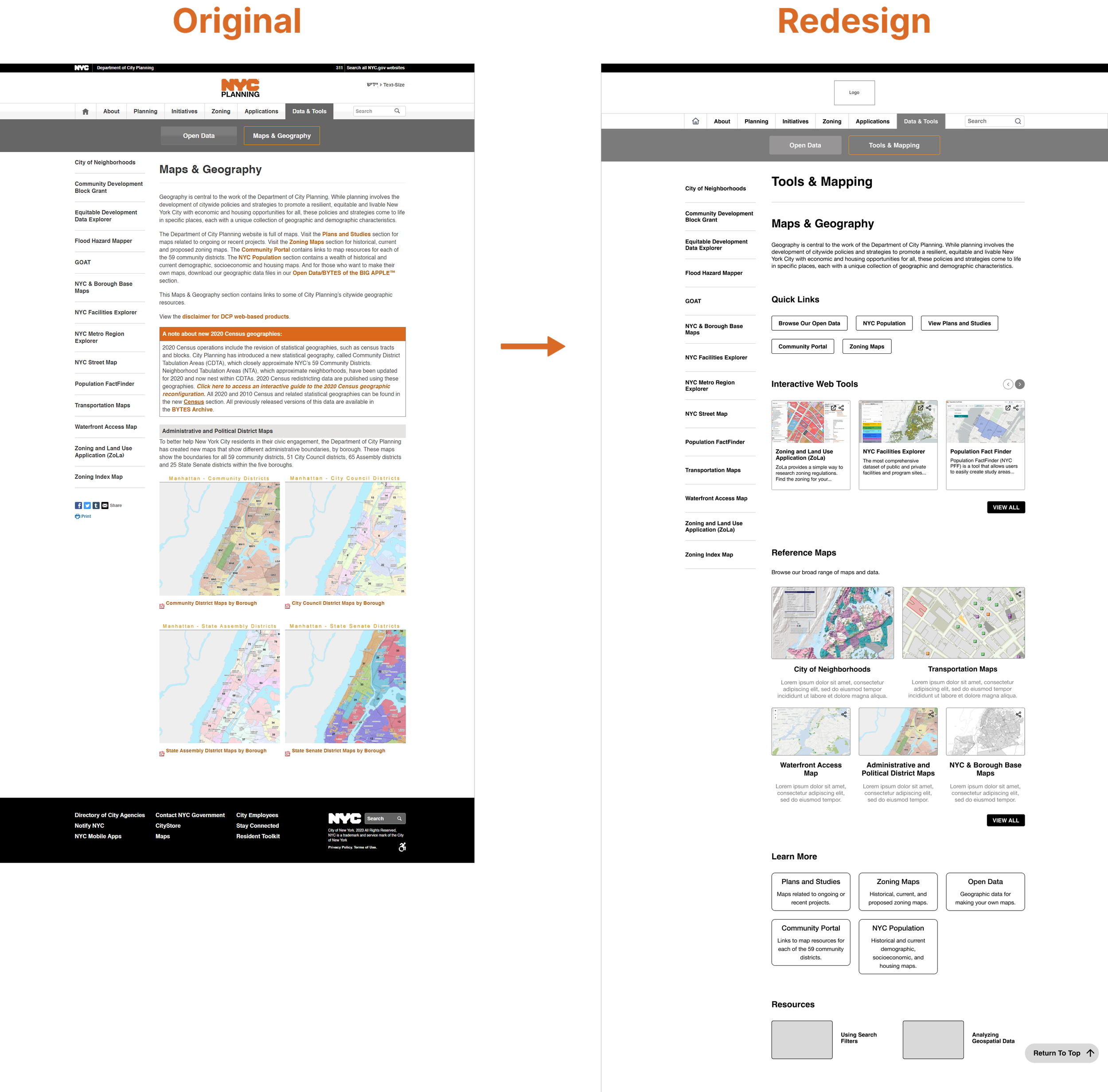
A week into the project, the execs shifted the scope of the project from redesigning the homepage to redesigning the entire website (which had well over 50 subpages.) Me and another intern focused on the Data & Tools section of the website while assisting the two other interaction designers in the research phase of the rest of the website. The Data & Tools section is one of the top visited parts of the site, and is comprised of two subsections: Open Data, and Maps and Geography.
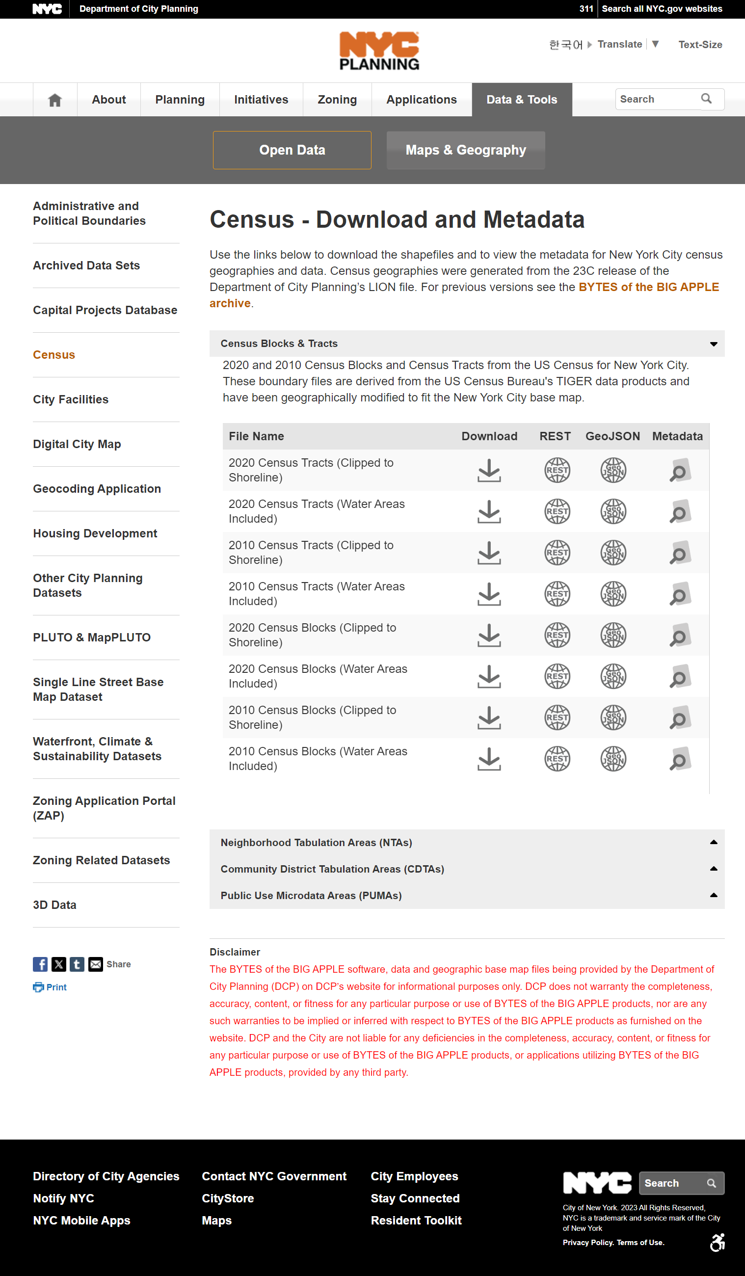
This is what a subpage (accessed by clicking on the Download or Metadata button under the Census accordion under Open Data) looks like. Aside from the overview, there are once again more accordions that potentially obscure information.
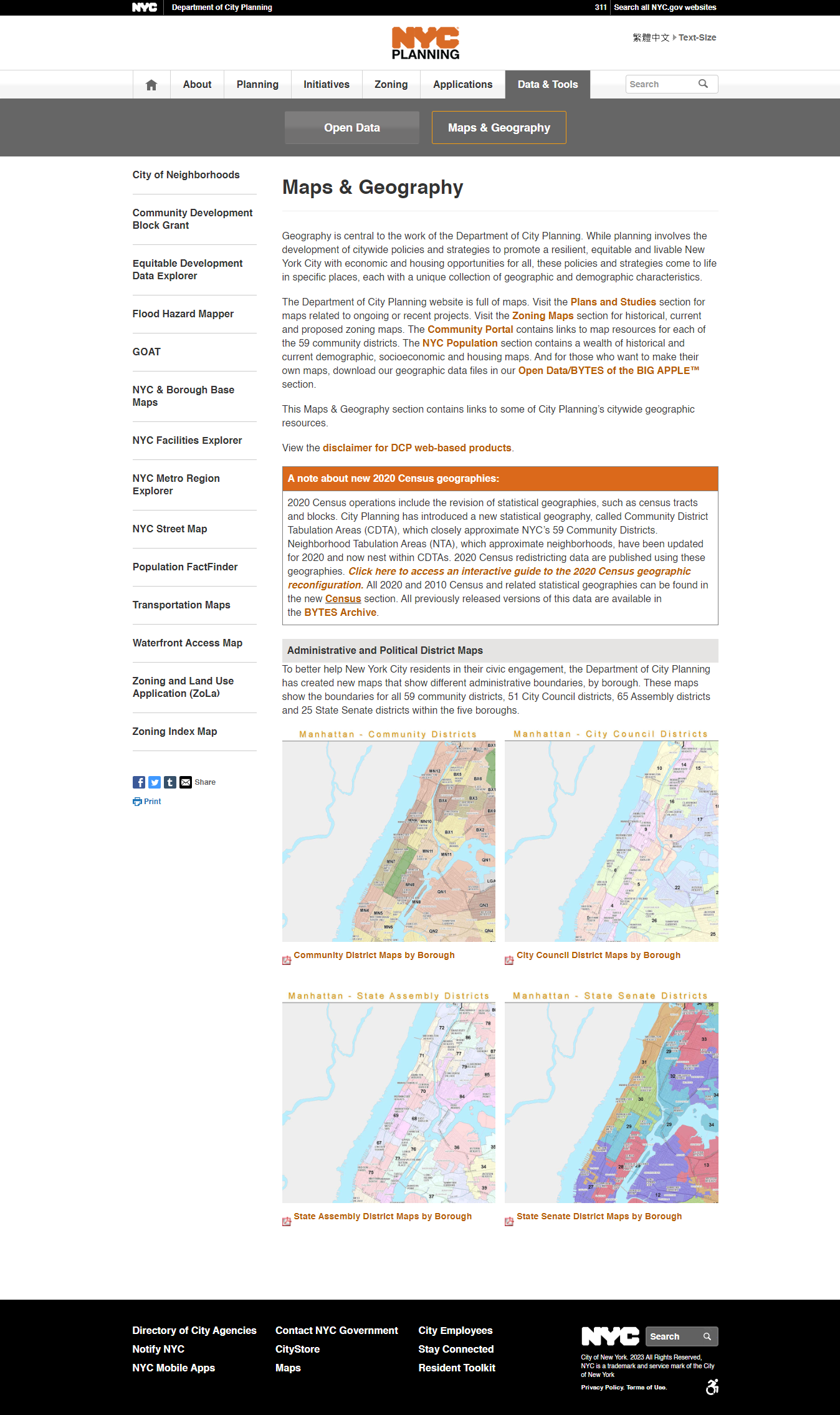
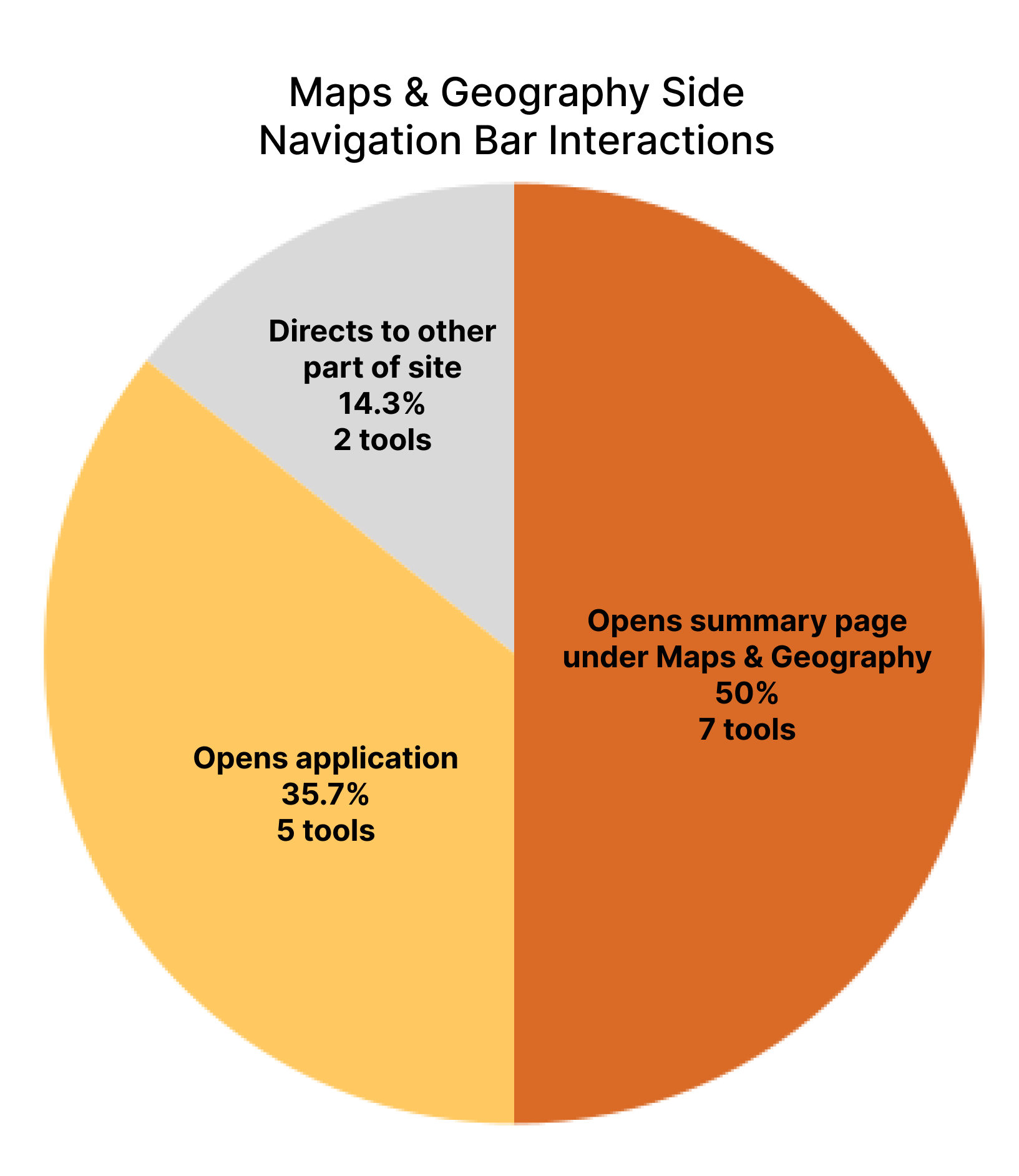
Maps and Geography contain a list of maps and tools DCP created. Unlike the Open Data page, a list of accordions with all the maps or tools is not present on the home page, so accessing certain tools would only be possible through the side navigation. Some tabs on the side navigation directly open up the tool (e.g. GOAT) while others lead to a new page with information about the tool and a link to it (e.g. Zoning and Land Use Application).
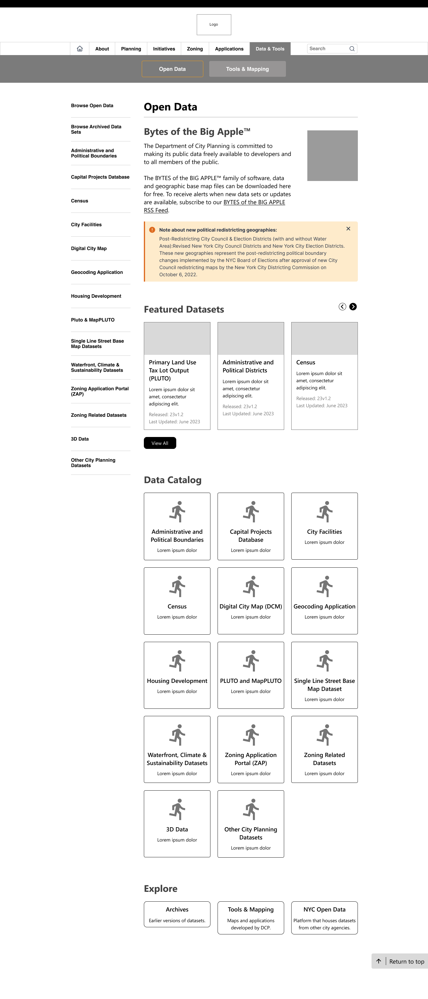
Open Data houses datasets created/released by DCP, and is what most Data & Tools users visit. Datasets are categorized into accordions, with subcategories listed under the accordions like so.
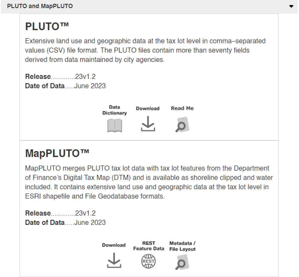
It is important to note that some of the download buttons under the accordions do not download the dataset, but actually lead to another page with additional information and links on that dataset.
03 Data & Tools Research
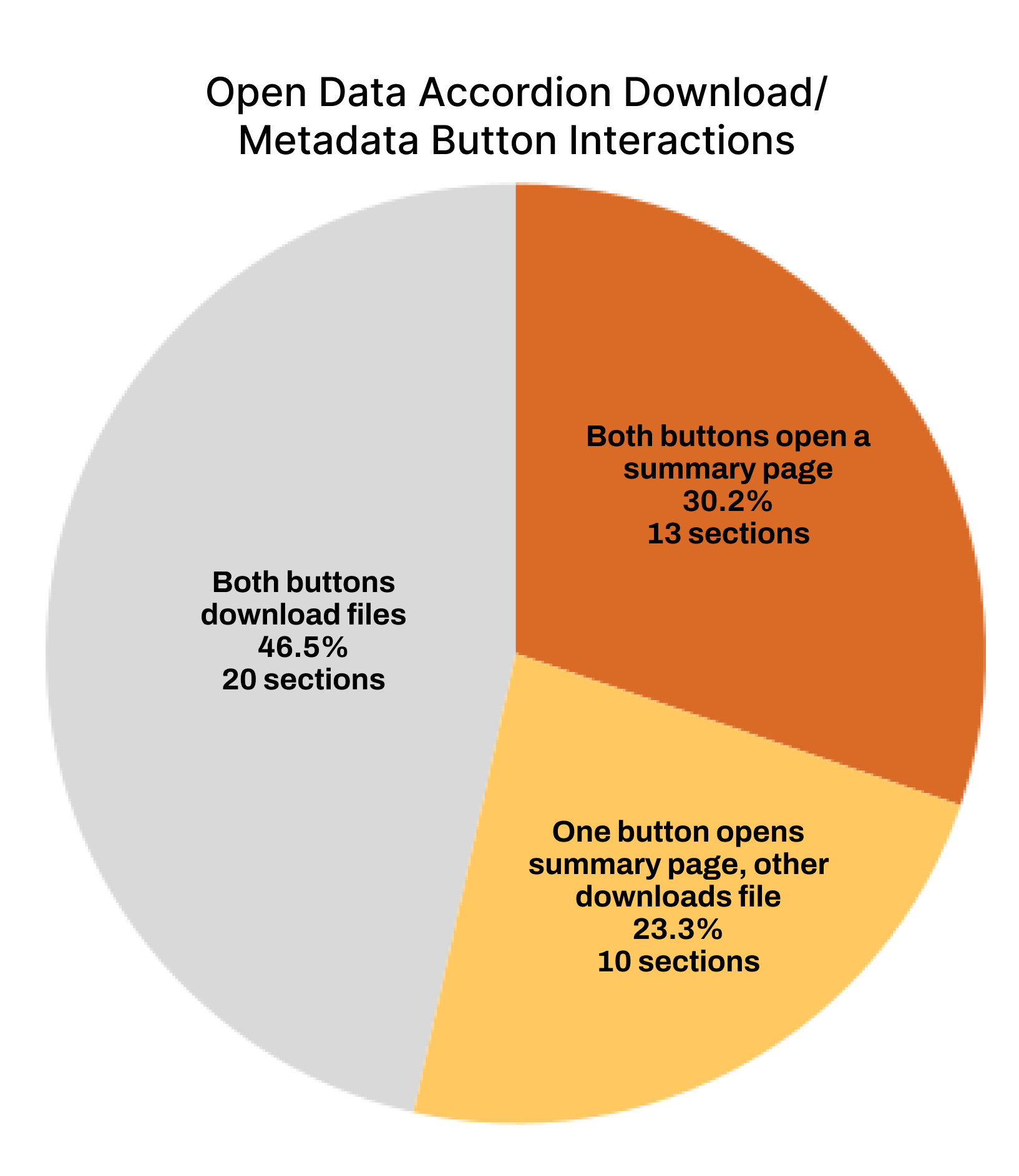
Our team received additional analytics about downloads, user paths, and views for the Data & Tools page. I did some basic data analysis to see the top datasets, as well as document all certain interactions to see the consistency between them. I went through all the download and metadata buttons under the accordions on the Open Data page, and clicked through the side navigation tabs on the Maps & Geography page.
The unexpected and inconsistent behaviors may make it harder for users to intuitively and easily navigate the site.
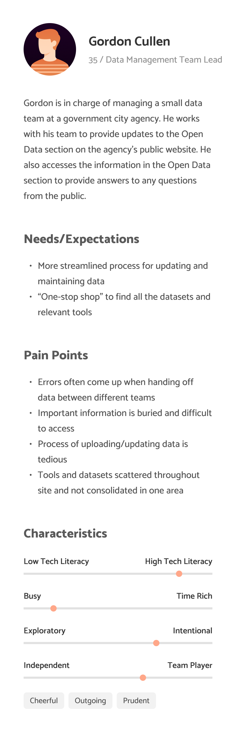
These were also touched upon during user interviews. We were able to arrange interviews with the two stakeholders of Data & Tools, as well as a power user who used Open Data often for their work. I moderated two of the user interviews for Data & Tools, and helped assist the interaction designers in interviewing regular users of the overall website. Our main takeaways from the user interviews were:

Unexpected interactions make the experience confusing and unnecessarily complicated

Inconsistencies with interactions, visuals, layouts, etc. make it harder to navigate
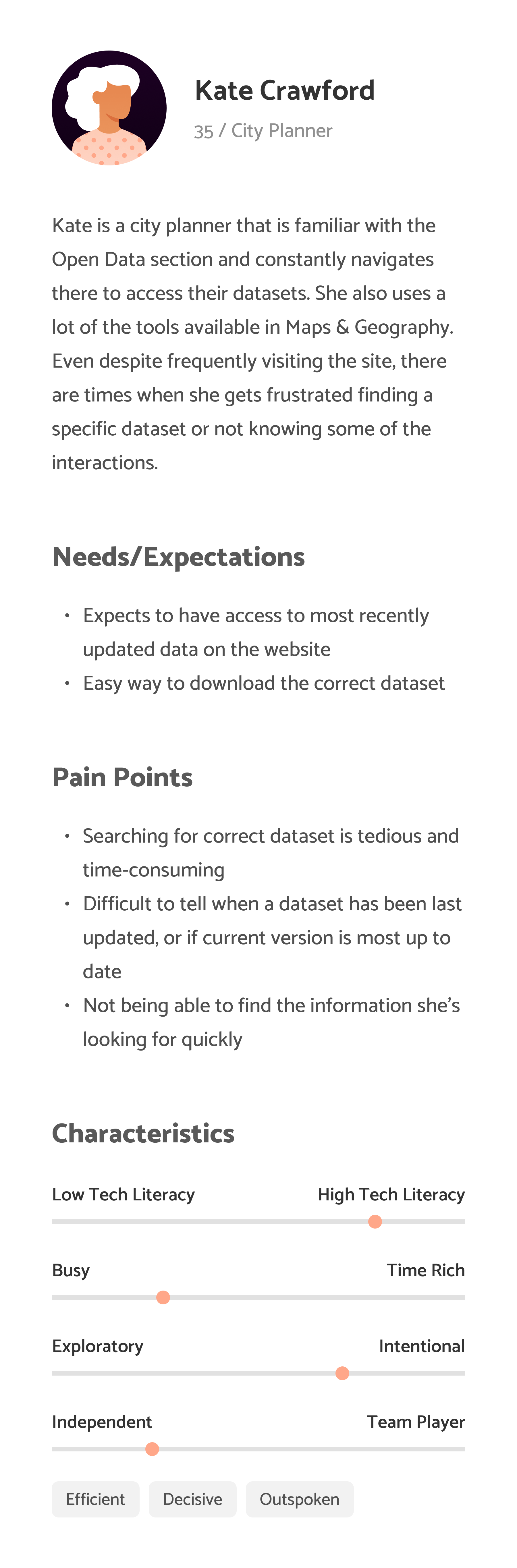

Information is obscured, making it difficult to search for relevant information quickly
There were two main types of users of the Data & Tools section of the site: stakeholders and power users. We determined that everyday New Yorkers would not have much use for this section of the site, and were more likely to visit the landing page and about page. We developed personas and empathy maps for each interviewee to better understand their goals, motivations, and pain points.
With our main takeaways and the persona and empathy maps we created, we developed our problem statement to hone in on the main problem at hand.
Users regularly encounter inconsistencies and unexpected interactions on the Data & Tools page. In turn, they have difficulty navigating the large amount of information to find what they are looking for. How might we better adhere to user expectations and reduce inconsistencies?
As we moved on to the design phase, we also had to keep constraints in mind, namely how certain layouts or components would be difficult to implement with TeamSite. There were also sections of the website that could not be touched, such as the margins, navigation, and footer. We made sure to keep that in mind alongside the pain points users mentioned when brainstorming solutions.
04 Designs
We started off with the Open Data page as it had more content. I created wireframes of what the layout should look like, keeping in mind that we wanted to facilitate easy access to popular datasets and encourage more site exploration.
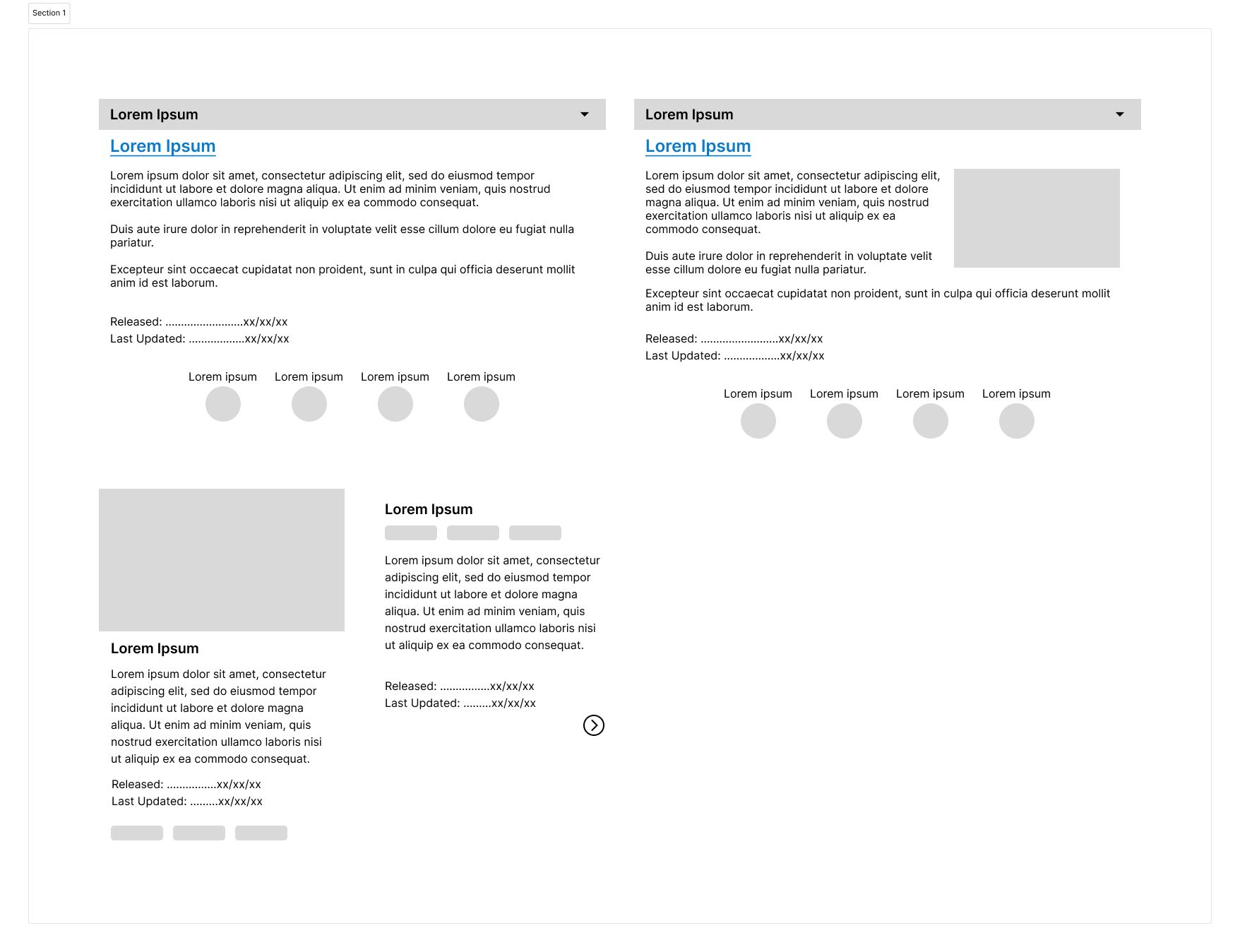
One thing I wanted to change was the accordions, as in our interviews users brought up that it was difficult to tell which subcategories were under which accordions, and there was no information unless you opened one up. I experimented with a few different layouts, some where the accordion content was changed, while others were a card structure which did not require any user interaction to view additional descriptions or information.
The download analytics indicated that the PLUTO dataset, NYC 3D Model, and Census dataset were the most viewed and downloaded. On the current page, some of them are located in the bottom accordions, requiring additional effort to scroll down and access them. I featured the most popular datasets at the top for easy access, and incorporated more visuals to break up the huge amount of text the page has. I changed the accordions to cards, adding icons and a bit of explanatory text under for additional context. This way, if a user had a dataset in a topic that was not featured, they would still be able to access it. A resource section was added to increase engagement by directing users to other parts of the site if they wanted to learn more or see related topics.
Aside from just the Open Data page that had accordions, the individual dataset subpages also had accordions. I decided to change that format as well, modifying it to a different type of card layout. With the table format, if there was one dataset that had a category the other datasets did not have, one extra column would have to be added to the table for that outlier.
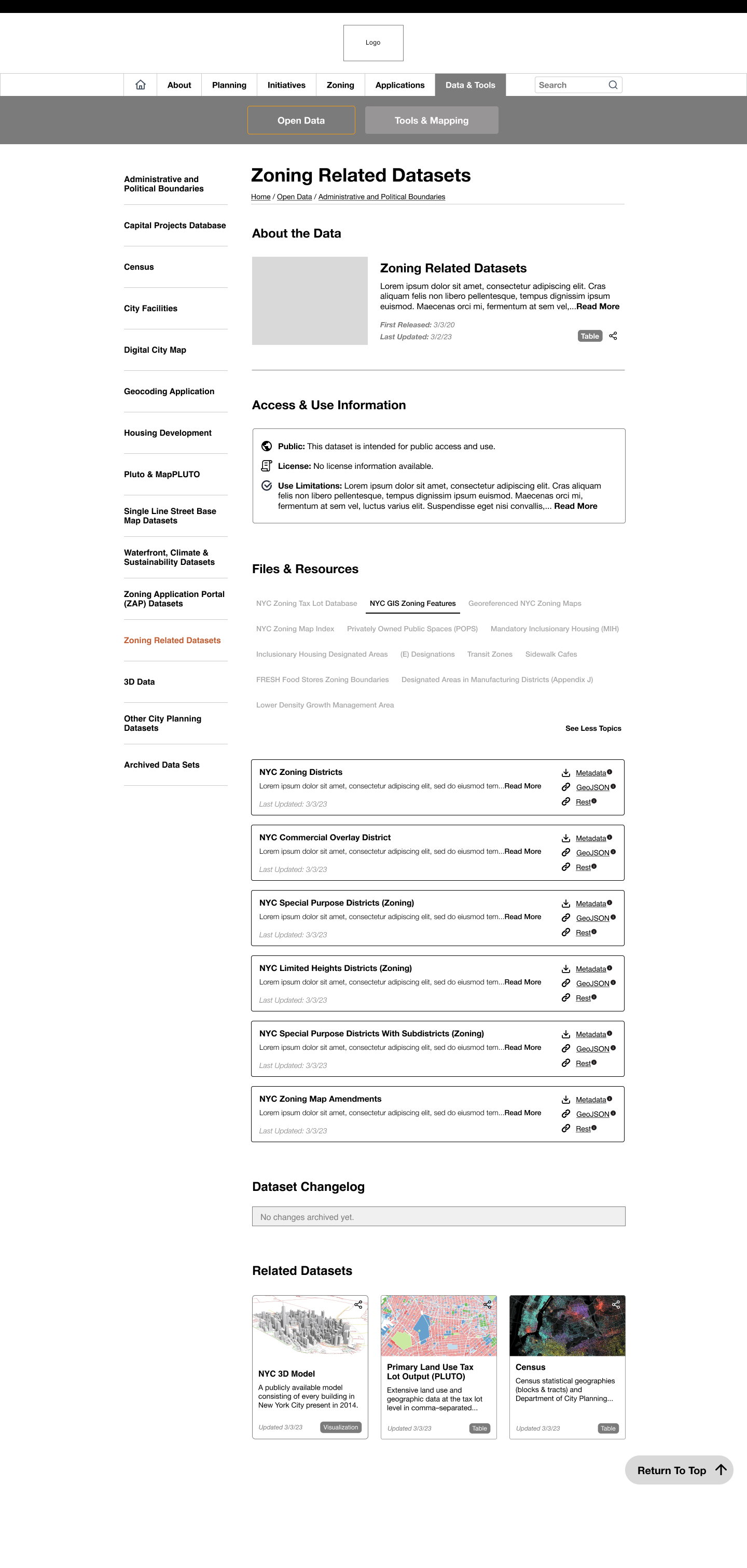
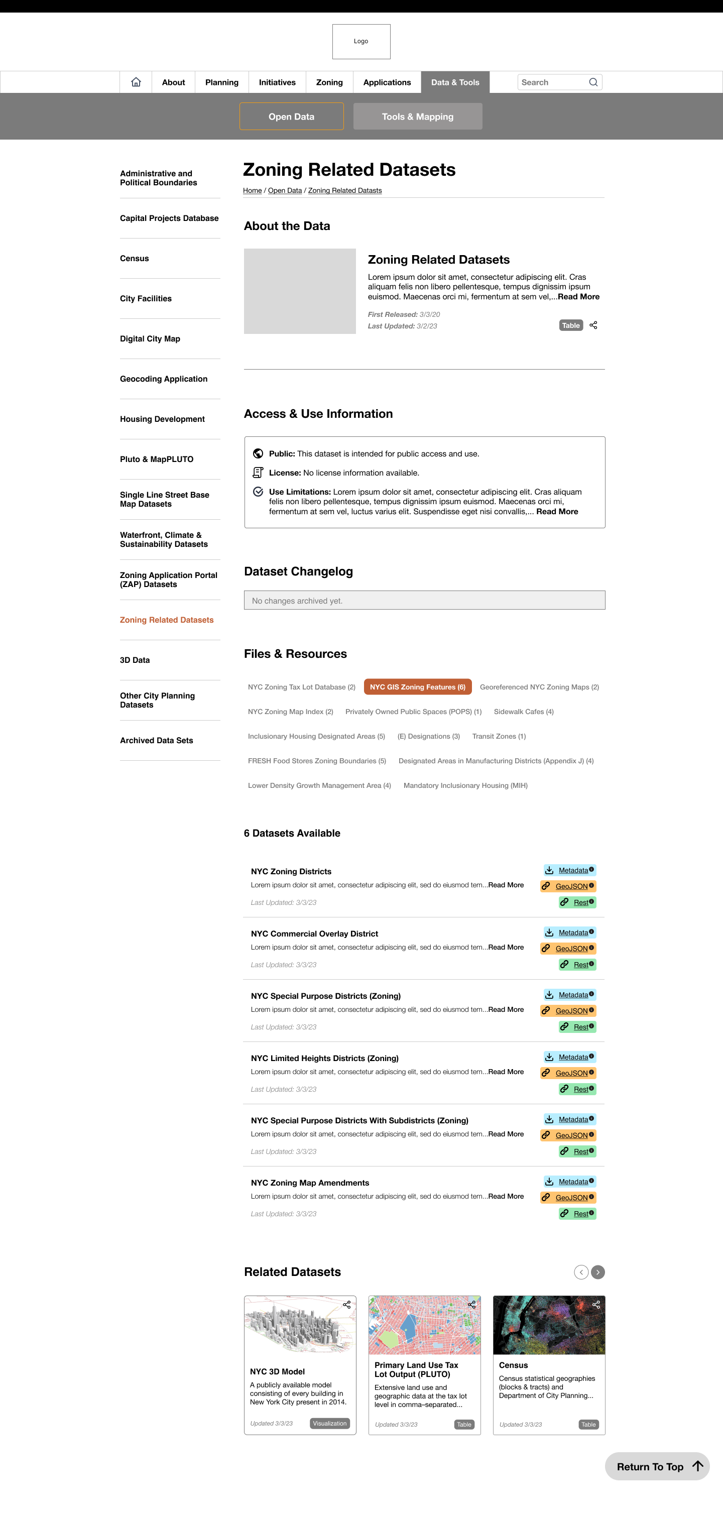
The card design has the actions on the right, and that easily allows for additional actions or information to be added as necessary. Furthermore, to increase transparency, I added a Dataset Changelog and an Access & Use Information section, drawing from user feedback from the interviews.
After iterating, I and the other intern got together to combine our designs. We settled on the following designs for the Open Data and Maps & Geography pages. We tried to keep formatting relatively consistent across the two sections, and encourage data exploration for new users while ensuring power users could easily get to the content they needed.
05 Showcase
One of the agency’s initiatives regarding their data was to be more open and transparent, which we followed by adding an Access & Use Information and Dataset Changelog. This allows users to much more easily access that information, as previously they were required to download the metadata files.
The accordions have been replaced with a tab system, and the numbers in parenthesis give a quick overview of the number of datasets contained within that category.
Attached files for each dataset (e.g. Metadata, GeoJSON, Rest, etc.) have been color-coded for additional visibility and distinction.
The redesigned Open Data page is meant to encourage more data exploration, with added features like the search bar, Quick Links, Learn More, and resources. Quick Links and Learn More have the same section, but Learn More has a description attached, meant to target newer users who are unfamiliar with the site, while Quick Links are for power users who need to quickly access something. The Data Tools feature the top datasets accessed, and the View All option takes users to a new page with cards of all the datasets sorted alphabetically.
The accordion topics were not included on the Open Data page since it would add too much text to parse, and they are still accessible via the side navigation.
Different users brought up how the naming of “Maps & Geography” was confusing, so we switched the overall heading to Tools & Mapping, as that was what the page consisted of: different tools/applications and maps of NYC. The layout is similar to the Open Data page for consistency, with the only difference being the Reference Maps.
As there were only 5 types of maps that were listed in this section, it made more sense to make them easily accessible from the home page.
06 Reflection
I enjoyed my time working at DCP and learning what design looked like in a government agency. One of the biggest blockers I had was designing around the constraints, as it was unclear even after speaking to the development team whether or not the organization would be switching to a different CMS for the redesign. The agency did not have a well-established design culture, but it was valuable practicing how to communicate design recommendations or changes to stakeholders that did not have a background in design. Given more time, I would have liked to create a more organized design system with proper documentation. I started working on it later on in the fellowship, and thus did not have the time to write out specific details for certain components, regulations, etc. It was nice to start a new design system considering the existing one was outdated and not maintained.
Even though the fellowship ended before the web team could implement any new redesigns, I would have liked to conduct some usability tests with Figma prototypes to see if the overall user flow for the Data & Tools section was improved. The team finished up affinity mapping the last week of my fellowship, and a common concern was accessibility and complex jargon that made the website more difficult for new users. Later down the line I think it would have been valuable to run some accessibility focused heuristic analysis.
I appreciate the opportunity I got this summer to design in the public sector, and I loved conducting interviews and speaking to different types of people. I got a lot more comfortable with user research, which was something that I did not practice much in my classes. The Coding It Forward fellowship definitely gave me more perspective on government work, and I loved the project I worked on and its impact.